20 Sep

10k lakes, 10k logos

Nicole Meyer is on a quest to redeem the common conception of the lake logo. “Lake logos have a tendency to be, well, fairly ugly”, says the designer. She is posting one logo a day on her site, with her sights set on branding Minnesota’s 10,000 lakes by the end of 27 years.

Although Meyer’s use of typography is outstanding, I was fairly taken with the simplest, most iconic ones. Which I think are the toughest to get right. Some of my favorites below.

Via LogoDesignLove.

PINE MOUNTAIN LAKE

KING LAKE

LAKE FIFTEEN

19 Sep

From vegan to vulgar

Just what is it that you love exactly?

There seems to be a string of tofu lovers out there being denied the right to express their feelings on their license plates. It’s a great visual communication case study: given the limited space in a vanity plate, we try to say more in fewer characters and let the people figure it out.

In this case, the latest request of this sort, the authorities say you can read too much out of this particular plate. Depending where your mind inserts the spaces I LV TOFU becomes I LV TO F U.

Well, at least it is still all about love!

PS. This seems to be OK in California…

16 Sep

Inside the mind of Valero Dorval

human by design No comments by K.

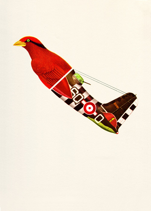
Browsing Valero Dorval’s porfolio is taking a slide down the rabbit hole into a land made of paper, ink and yellowing clippings. No matter if it’s personal or commercial, the Spaniard’s magical discourse shines through the page, or screen, mind you. Via craftzine.

Valero Dorval's Aerofauna II

A wonderful world II. It certainly is!

« Previous PageNext Page »